Separator Control
Separator
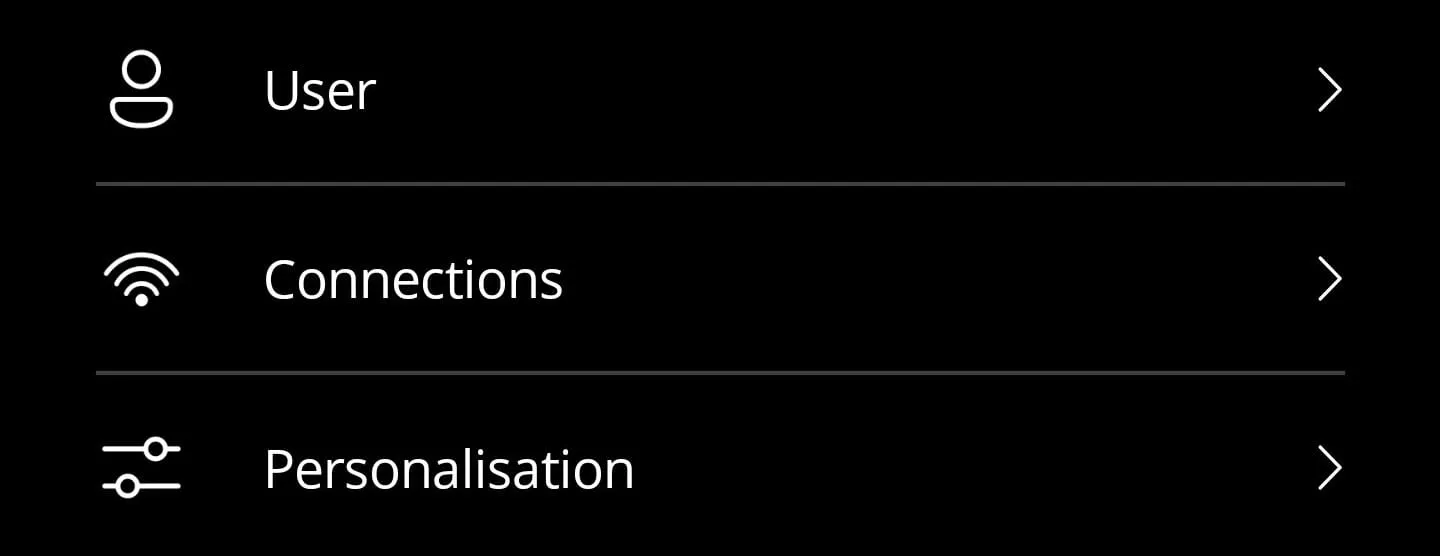
You can use the separator to separate elements from each other. This separates the elements with a horizontal line. This can then look like this:
Key features
- Lightweight control that renders a simple
BoxView, making it easy to theme. - Bindable
Colorproperty so you can adapt to different sections or accent palettes. - Minimal layout margin ensures consistent spacing between settings rows.
Here is the corresponding code for it:
<?xml version="1.0" encoding="utf-8"?>
<ContentView xmlns="http://schemas.microsoft.com/dotnet/2021/maui"            xmlns:x="http://schemas.microsoft.com/winfx/2009/xaml"            x:Class="App.Elements.Separator">
<StackLayout Margin="25,-1,25,-1"> <BoxView x:Name="BoxView" HeightRequest="1" Color="{AppThemeBinding Light={StaticResource Gray200}, Dark={StaticResource Gray600}}" /> </StackLayout></ContentView>namespace App.Elements;
public partial class Separator : ContentView{
#region Fields
public static readonly BindableProperty ColorProperty = BindableProperty.Create(nameof(Color), typeof(Color), typeof(Separator), Color.FromArgb("#6E6E6E"));
#endregion
#region Properties
public Color Color { get => (Color)GetValue(ColorProperty); set => SetValue(ColorProperty, value); }
#endregion
public Separator() { InitializeComponent(); }
#region Methods
protected override void OnPropertyChanged(string propertyName = null) { base.OnPropertyChanged(propertyName);
if (propertyName == ColorProperty.PropertyName) BoxView.Color = Color; }
#endregion
}Style
<Color x:Key="Gray200">#C8C8C8</Color><Color x:Key="Gray600">#404040</Color>How to use
<ContentPage xmlns="http://schemas.microsoft.com/dotnet/2021/maui"             xmlns:x="http://schemas.microsoft.com/winfx/2009/xaml"             xmlns:elements="using:App.Elements">
    <StackLayout>        <elements:Button IconSource="{fluent:Icon Icon=Person48}"                        Text="User" />
        <elements:Separator />
        <elements:Button IconSource="{fluent:Icon Icon=Wifi120}"                        Text="Connections" />
        <elements:Separator />
        <elements:Button IconSource="{fluent:Icon Icon=Options48}"                        Text="Personalisation" />    </StackLayout></ContentPage>
NuGet Packages
Implementation notes
- Bind the
Colorproperty to theme resources to maintain consistent contrast across light and dark palettes. - When stacking multiple separators, adjust the surrounding layout margins rather than changing the control height so screen readers continue to perceive it as decorative.
- If you host the separator inside a
CollectionView, mark it asIsVisible="False"for the first item to avoid an extra line at the top of the list.