Settings Group Panel
Settings Group Panel
This element is used to group multiple elements with headings. It could then look like this:
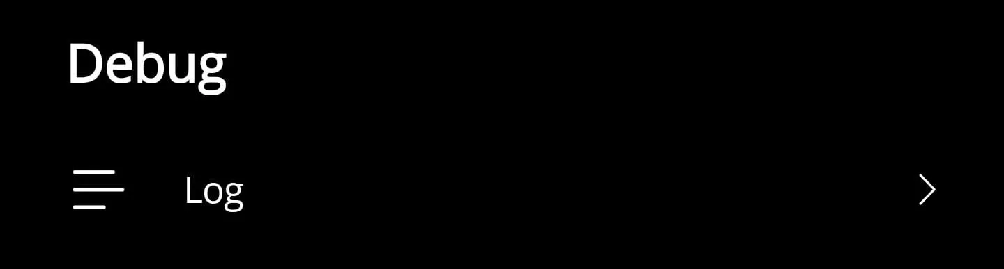
Key features
- Wraps arbitrary content, making it ideal for bundling toggles or form fields under a shared label.
- Exposes font sizing through a bindable property so you can align with your typographic scale.
- Uses a control template, allowing you to restyle the layout without rewriting the control.
Here is the corresponding code for it:
<?xml version="1.0" encoding="utf-8"?>
<ContentView xmlns="http://schemas.microsoft.com/dotnet/2021/maui"            xmlns:x="http://schemas.microsoft.com/winfx/2009/xaml"            x:Class="App.Elements.Group">
    <ContentView.ControlTemplate>        <ControlTemplate>            <StackLayout Margin="0,0,0,30">                <Label x:Name="LabelTitle" Text="{TemplateBinding Title}"                    FontSize="{TemplateBinding FontSize}" Margin="25,10,10,10" FontAttributes="Bold" />
<ContentPresenter /> </StackLayout> </ControlTemplate> </ContentView.ControlTemplate></ContentView>namespace App.Elements;
public partial class Group : ContentView{
#region Fields
public static readonly BindableProperty FontSizeProperty = BindableProperty.Create(nameof(FontSize), typeof(int), typeof(Group), 20);
public static readonly BindableProperty TitleProperty = BindableProperty.Create(nameof(Title), typeof(string), typeof(Group), string.Empty);
#endregion
#region Properties
public int FontSize { get => (int)GetValue(FontSizeProperty); set => SetValue(FontSizeProperty, value); }
public string Title { get => (string)GetValue(TitleProperty); set => SetValue(TitleProperty, value); }
#endregion
public Group() { InitializeComponent(); }}How to use
<ContentPage xmlns="http://schemas.microsoft.com/dotnet/2021/maui"             xmlns:x="http://schemas.microsoft.com/winfx/2009/xaml"             xmlns:elements="using:App.Elements">
    <Grid>
        <elements:Group x:Name="Group" Title="Settings" FontSize="20">            <StackLayout>                <Label Text="Settings" />                <Label Text="Settings" />                <Label Text="Settings" />            </StackLayout>        </elements:Group>
    </Grid></ContentPage>
Implementation notes
- Bind the
Titleproperty to localized resources when building multilingual settings pages. - If you need separators between groups, combine this control with the Separator Control for consistent styling.
- Wrap the control in a
DataTemplateto populate grouped content from collection data.